


Exploratory Data Analysis on Any Dataset
EDA crash course on a sample time series dataset.


I believe that data science can be done without machine learning, but the opposite is not possible. To do any bit of machine learning, we need to have a better and deeper understanding of the dataset at hand. The machine learning model is only as good as the dataset it has been trained on.
In this blog post, I try to show you how to derive insights from any dataset using a framework called Exploratory Data Analysis. I hope you find it helpful.
For this post, we are going to use a synthetic (hypothetical) dataset given by Kaggle in a recent Playground series. The dataset contains daily sales of fictitious stores, selling fictitious products across 5 countries.
We shall get into the details of the dataset and derive many insights from it using graphical and non-graphical Python tools. Although this dataset is fictitious, the main takeaway should be the thought process I go through while I dig into the data.
Are you ready?
As always, here's the Kaggle Notebook for you to follow along.
As we get into the data, let's try to understand the concepts of Exploratory Data Analysis in parallel.
Exploratory Data Analysis
As the words in the title suggest, this is a broad open-ended endeavour to analyse the given data. It's exploratory so it's important to keep an unbiased and open mind because each data set is different.
When doing such an open-ended task, it's useful to have a framework to work it rather than just winging it at the data. The following are the fundamental steps involved in an EDA task and if done in order, they can be a nice way to deal with any kind of dataset.
Load the data
Univariate Analysis
Multivariate Analysis
Handling Missing Values
Handling Outliers
Feature Engineering
Let's look at each of these steps in detail using our synthetic sales dataset.
Load the data
Datasets come in various types and formats. They could be in text files, CSV files, image files, video files, database tables etc.
For this exercise, we are going to use the CSV files provided by Kaggle as part of a competition.
To load the CSV data, we can use the 'read_csv' function from the Pandas library.
import pandas as pd
train_data = pd.read_csv('/kaggle/input/playground-series-s3e19/train.csv')
Let's first look at the shape of the data.
train_data.shape
output:
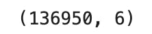
So there are 136950 rows and 6 columns in the CSV file excluding the headers.
Let's take a look at the dataset's top 5 rows using the 'head' function.
train_data.head()
output:
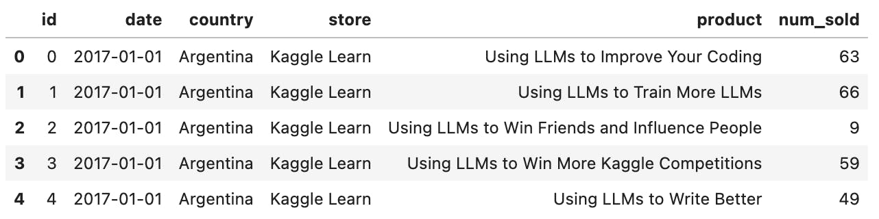
Ok, here is where we draw first impressions. In other words, let's feel the data.
The columns at hand are:
id
date
country
store
product
num_sold
This is one of the simplest of datasets, created by Kaggle specifically for practising data science and machine learning. Real-world datasets can be quite complex and can have a lot more columns. Mostly the data would be residing in many tables in a large database and it is up to the business and the engineering team to decide and share what's useful to solve the problem at hand.
It's important to know the meaning of each column in the dataset to avoid any false assumptions. So remember to get a data dictionary of sorts which explains the meaning of each column from the relevant stakeholders.
As the given dataset is one the simplest datasets, it makes a great candidate for practising and learning the exploratory data analysis framework. For our dataset, here's the data dictionary.
| Column | Definition |
| id | unique identifier for the record |
| date | date of the sales recorded |
| country | country where the sales happened |
| store | name of the store where the sales happened |
| product | name of the product which was sold |
| num_sold | number of times the product was sold |
So to summarise, there are some fictitious products which were sold in some fictitious stores across different countries and the daily sales of each product have been recorded in the dataset. Since this is a record of daily sales, you can already tell this is a time series dataset. A time-series dataset is where the behaviour of anything is recorded over time.
If you see the first row in the dataset, it tells us that the product 'Using LLMs to improve your coding' was sold 63 times in a store called 'Kaggle Learn' in Argentina on January 1st 2017.
It so happens that the first 5 rows in the dataset were the sales from Argentina. If you want to get a better first look at the dataset, we can use the 'sample' function.
Let's pick 10 random rows from the dataset.
train_data.sample(10)
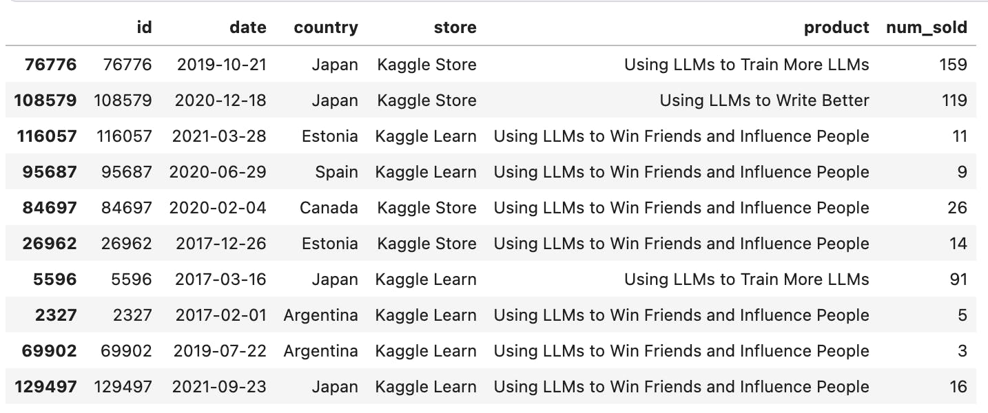
Yes, this is a better snapshot to feel the data better. We can see multiple products being sold across multiple stores and countries.
We can get some other general insights as well from the dataset using the "info" function.
train_data.info()
output:
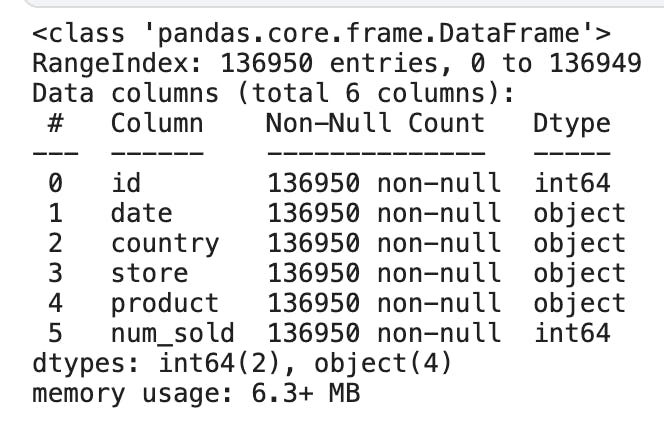
Here we can see that there are a total of 6 columns, of which two are of type "int64", and the remaining four are of type "object". The values with "object" type can be text, date or a mix of numbers and text. Another insight is that there are no null values in any of the columns. Null values are nothing but missing values.
If there were any null values in the dataset, there are some ways to take care of them which we shall see in the 'Handling missing values' section below.
There is another useful general-purpose function called "describe".
train_data.describe()
output:
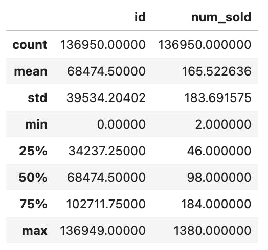
The "describe" function takes all the numerical columns and gives us some key metrics on each of them.
In our case, there is only one numeric column "num_sold" (we can ignore the "id" column here as it's just a unique identifier and does not have any contextual reference to the dataset).
We can see that the average value is 165, min value is 2, max value is 1380 and so on.
So far we have seen pandas tools to get an overall picture of the dataset. These are the commonly used functions to get started with any kind of tabular dataset.
This is a good start. Let's move on to the next step.
Univariate Analysis
The next step in the framework is the Univariate analysis. As you can probably guess from the word itself it's an analysis of one variable (uni-variate).
In our sales dataset, we have just a few columns. So we can check each column individually. In a large dataset containing tens of columns, it's not feasible to check each column, so you need to check with the key stakeholders to get the most important columns to look at individually if at all required.
Going forward, we can use the following pattern.
code
output
inference
We are going to write some code that answers a specific question about the data set. Then we are going to get some output from which we are going to make as many inferences as we can.
Let's take the "date" column first. Since it's a date field, let's see the range of the data set.
code:
print(train_data.date.min())
print(train_data.date.max())
output:
2017-01-01
2021-12-31
inference:
The date range spans from 1st January 2017 to 31st December 2021. It's a 5-year data set.
Next, let's take the categorical variable "country". We can ask questions like how many rows are there in the dataset for each country.
code:
train_data.country.value_counts()
output:
Argentina 27390
Canada 27390
Estonia 27390
Japan 27390
Spain 27390
Name: country, dtype: int64
inference:
there are 5 countries in the train data. all countries have an equal number of entries.
We can also look at the percentage distribution of each country.
code:
train_data.country.value_counts() / train_data.shape[0] * 100
output:
Argentina 20.0
Canada 20.0
Estonia 20.0
Japan 20.0
Spain 20.0
Name: country, dtype: float64
inference:
As expected, there is an equal distribution among the countries in the dataset.
So far we have been using non-graphical EDA. But we can also use charts to view the data easily.
For this, we are going to use a popular library called "plotly". I prefer "plotly" over others because it gives out interactive charts instead of static ones. Plus, the colours used are nice and elegant.
Let's draw a distribution chart for "country".
code:
# import plotly librarires
import plotly.express as px
import plotly.graph_objects as go

country_counts = train_data['country'].value_counts().reset_index()
country_counts.columns = ['country', 'count']
fig = px.pie(country_counts, values='count', names='country', title='Country Count Distribution')
fig.show()
output:

inference:
Equal distribution among countries.
We can continue and ask similar questions on the other categorial columns "store" and "product". Assuming you already got the gist of it, I'm going to skip the repetitive charts. Please feel free to explore the Kaggle notebook.
Now moving on to the "num_sold" variable which is the most important of all columns.
We already kind of looked at it when we used the "describe" function earlier. Let's bring it back for a second, this time we're going to specify the column name as well in the code.
code:
train_data.num_sold.describe()
output:
count 136950.000000
mean 165.522636
std 183.691575
min 2.000000
25% 46.000000
50% 98.000000
75% 184.000000
max 1380.000000
Name: num_sold, dtype: float64
inference:
Min value is 2, max value is 1380. The average is 165.
Do you see anything strange about these numbers? Observe the 75% value which is 184 and the max value is 1380. The numbers 25%, 50%, and 75% are percentile values of the column i.e., if the values were sorted in ascending order, the top 25% of values lie between 2 and 46. Values lie between 46 and 98 between 25% and 50%. And so on.
So the above output is telling us that 75% of values are under 184, but the max value is 1380 which seems very distant from the 75%. There is a steady rise upto 75% but the max is far beyond.
Let's investigate this further using distribution charts.
code:
fig_histogram = px.histogram(train_data, x='num_sold', nbins=20, title='Distribution of num_sold')
fig_boxplot = go.Figure()
fig_boxplot.add_trace(go.Box(y=train_data['num_sold'], name='num_sold'))
fig_histogram.show()
fig_boxplot.show()
output:
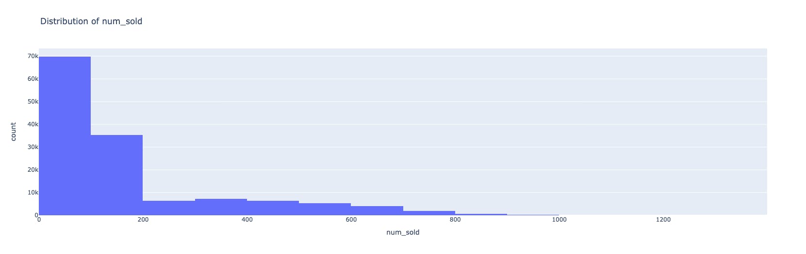
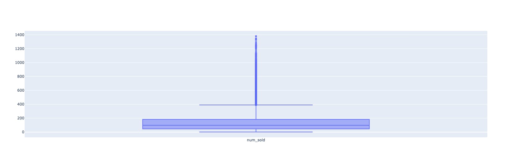
inference:
As we can see in the hist plot, the data is skewed to the left. The box plot also confirms that the upper boundary is around 400, but there are other values which are higher than normal.
These extreme values are called "outliers" and they need to be handled as part of preprocessing of data. We will learn about how to handle them in the section "Handling Outliers".
If you are new to these charts or want to know more about them please see this "plotly" documentation.
That completes our Univariate Analysis for the dataset at hand. Note that this is not an exhaustive set of questions. You might be asking different questions about the columns. Remember that it's an open-ended exploration. The more questions you have, the better your understanding of your data.
Let's now change our angle from single columns to multiple columns and see if there are any interesting relationships or patterns among them.
Multivariate Analysis
This is where we take our analysis to the next level and look beyond single columns. We can look at relationships between two or even three columns. Beyond that, although technically possible, it's very hard to read and understand the data. Even more difficult to explain it to someone else.
Let's take two columns from our dataset.
In most cases, there are feature variables and just one target variable. In our case, the feature variables are store, country, product and date. The target variable is 'num_sold'.
So when we are doing multivariate analysis, it's beneficial to start looking for relationships between any one feature variable against the target variable.
Let's take the feature variable 'date' and the target variable 'num_sold'.
As 'date' is a time series column, let's plot a time-series chart.
code:
train_data['date'] = pd.to_datetime(train_data['date'])
sales_by_date = train_data.groupby('date')['num_sold'].sum().reset_index()
fig = px.line(sales_by_date, x='date', y='num_sold', title='Sales Over Time')
fig.show()
output:
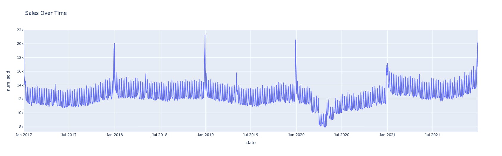
inference:
This is a fantastic plot. Let's see what we can infer:
This is a plot for the range 2017-2021. There are 5 years of data points on display.
There are occasional spikes at the end of each year. These can be attributed to the holiday sales during Christmas and New Year's Eve.
There is a noticeable slump in sales in the year 2020. Especially during the early months of 2020. Can you guess the reason behind it? It's probably due to the Covid-19 pandemic.
The sales restored to normal trend back in 2021.
There you go, that was our first multivariable analysis of date vs sales.
Since this is time series data, we can also ask questions about trends and stationarity.
code:
from statsmodels.tsa.stattools import adfuller
from statsmodels.tsa.seasonal import seasonal_decompose

result = adfuller(train_data['num_sold'])
print('ADF Statistic:', result[0])
print('p-value:', result[1])
print('Critical Values:')
for key, value in result[4].items():
    print(f'{key}: {value}')
output:
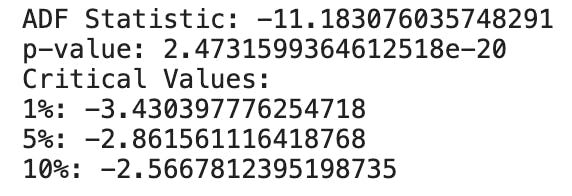
inference:
p-value: The p-value associated with the ADF statistic is 2.4731599364612518e-20, which is very close to zero. The p-value represents the probability that the null hypothesis of non-stationarity is true. A low p-value (typically below a significance level of 0.05) suggests rejecting the null hypothesis and concluding that the data is stationary. In this case, the extremely small p-value indicates strong evidence for stationarity.
If you want to know more about the ADF test, you can read about it here.
Augmented Dickey Fuller Test (ADF Test) – Must Read Guide
Let's pick another set. This time, let's ask how sales are affected by 'country'.
code:
sales_by_country = train_data.groupby('country')['num_sold'].sum().reset_index()
fig = px.pie(sales_by_country, values='num_sold', names='country', title='Sales Distribution by Country')
fig.show()
output:

inference:
most sales happened in Canada (~30%), followed by Japan (~26.5%)
least sales were seen in Argentina (~7.4%)
Why don't you try to answer this question?
"Which product is the best seller in the year 2020, the year of Covid-19?"
Ok, moving on.
Let's do one example with three columns involved.
But this time, let's take a non-graphical approach, just to show you that we don't always need fancy charts to derive insights.
We shall take the set of 'product', 'store' and 'num_sold' and see how they relate with each other.
code:
train_data.groupby(by=['store','product'])['num_sold'].sum().sort_values(ascending=False)
output:
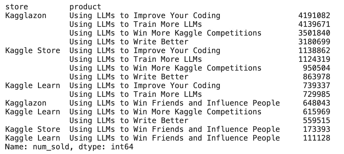
inference:
This is the table of overall sales per product, per store. What can this table tell us?
Among all stores, the product 'Using LLMs to Improve Your Coding' is the best seller.
The store 'Kagglazon' is leading the charts on all five products.
The product 'Using LLMs to Win Friends and Influence People' has the lowest sales across all stores.
In this way, you can take any combination of the columns and check its relationship with the target variable.
Pretty neat, right?
We have come a long way from just feeling the data, looking at single columns, double columns and now even triple columns.
Do you now feel you know the dataset better than when you started?
That's what exploratory data analysis is all about. It's about making friends with the data and asking it questions.
If you have noticed, so far we have only been reading the data as it is from the dataset. We haven't been changing anything in the dataset to make it even better or polished. Let's look at some important steps in pre-processing the data.
Handling missing values
When we used the 'info' function earlier, we saw that there were no null values in our dataset. That's usually not the case. In a real-world dataset, there could be missing values in some of the columns and it is up to the data scientist to handle them.
Here are our options to handle the missing values:
remove the rows with null values using the "dropna" function
fill the missing values with some other value using the "fillna" function
if the entire or most rows in a column are having null values, then consider dropping the column using the "drop" function.
All these functions are part of the "pandas" library and you can check out the official documentation here.
While dropping the null rows is straightforward, filling the missing rows with some other values is not so straightforward.
The filling of these missing values is called 'Interpolation'. The common ways used to fill in the missing values are to use either the 'mode' or 'mean' or 'median'.
mode - fill with the most occurring value, useful in categorical data
mean - fill with the average value, useful in numerical data
median - fill with the median value (50th percentile), useful in numerical data with some outliers
It is best to discuss with the key stakeholders and decide which is the best interpolation method to apply considering the business use cases.
This is an essential pre-processing step as the machine learning model needs a well-polished dataset with no missing values.
Next, let's look at how to manage extreme values.
Handling outliers
In numerical columns, there could be erroneous data. Data that doesn't make sense in the general context of things. For example, if there is a human 'age' column, it can't possibly have 2500 as a value. If the average sales are around the 400 mark, one value cannot be in lakhs or in the negative range.
These are errors in data, also known as extreme values, also known as outliers.
How do we identify these outliers? We can do so using the boxplots.
In our dataset, we have a numeric column 'num_sold' and this is the box plot for it.
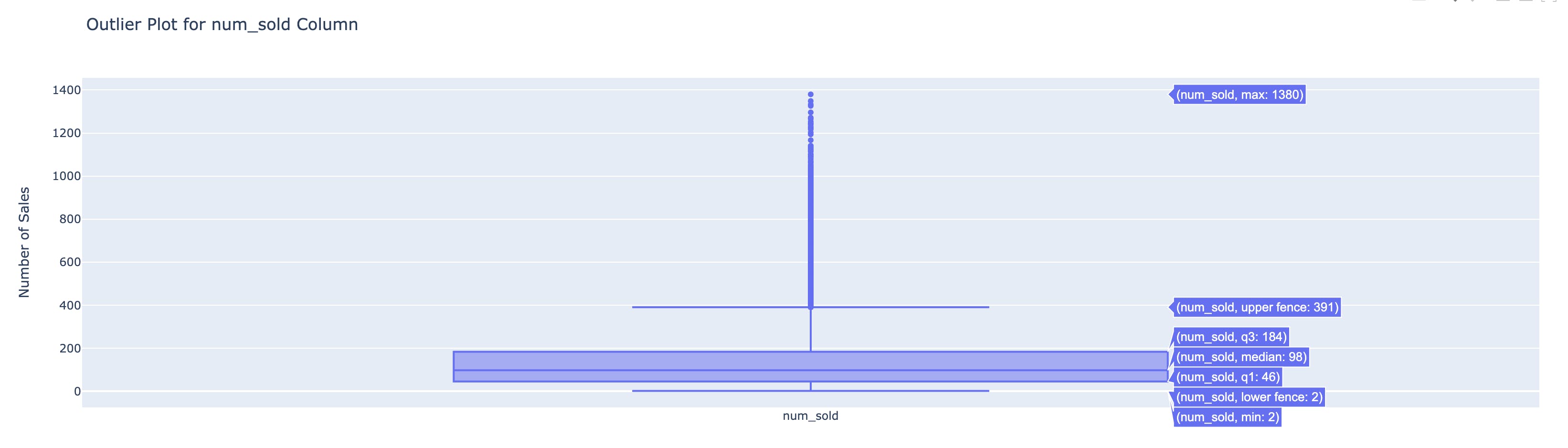
When you hover over the chart, you can see the quartile ranges. As you can see the upper fence is 391 but the max value is 1380 and there are a bunch of data points between the upper fence and the max.
All these data points can be potential outliers. When you see such extreme values, it's important not to assume anything and contact the stakeholders with this information. If they say that the data is indeed accurate and shouldn't be manipulated then there's nothing we can do.
But if they also feel that these can be removed or addressed in some other way, we need to do so. Because these values can manipulate the machine learning model and skew the results towards them.
If there are just one or two entries that fall in the extreme range, it usually makes sense to remove them. If there are more, a common practice is to use the Inter-Quartile-Range(IQR) and remove the outliers.
I shall not discuss the details of this method here because this is already a long post, but you can learn about the technique here.
Dealing with outliers using the IQR method
So far, we have looked at the columns, and their relationships and we handled the anomalies in the data. Let's take it a step further and create new columns so that there are more feature variables which can help the machine learning model learn better.
Feature engineering
This is an exciting last step in the exploratory data analysis framework. Here, we have a thorough understanding of the given dataset and we are now thinking beyond the given columns.
We are asking questions like, "What if there was an extra column which gives the moving average", "What if we have a month column which can tell us monthly sales", and "What if we add a new column that says whether that date is a holiday or not".
The questions can be endless, very context specific or general. The purpose of the exercise is to create new feature variables that weren't part of the original dataset but would make sense to have.
It's important not to add features just for the sake of it, but to keep only those variables that are required for efficient machine learning. More variables don't implicitly mean better model building, so choose wisely.
For our sales database, I got the holidays list using the 'holidays' library and used it to create a new column.
code:
import holidays

# Create a list of years from 2017 to 2021
years = list(range(2017, 2022))

# Get the holiday list for the United States for each year
us_holidays = []
for year in years:
    us_holidays.extend(holidays.US(years=year))

# Convert the holiday dates to strings in the 'YYYY-MM-DD' format
us_holidays_list = [str(holiday) for holiday in us_holidays]

# Print the list of holidays
print(us_holidays_list)
# Convert the 'date' column to datetime type (if it's not already)
train_data['date'] = pd.to_datetime(train_data['date'])

# Create a new column 'holiday' and set it to True for holiday dates, and False otherwise
train_data['holiday'] = train_data['date'].isin(us_holidays_list)

# Show the modified DataFrame
print(train_data.sample(10))
output:
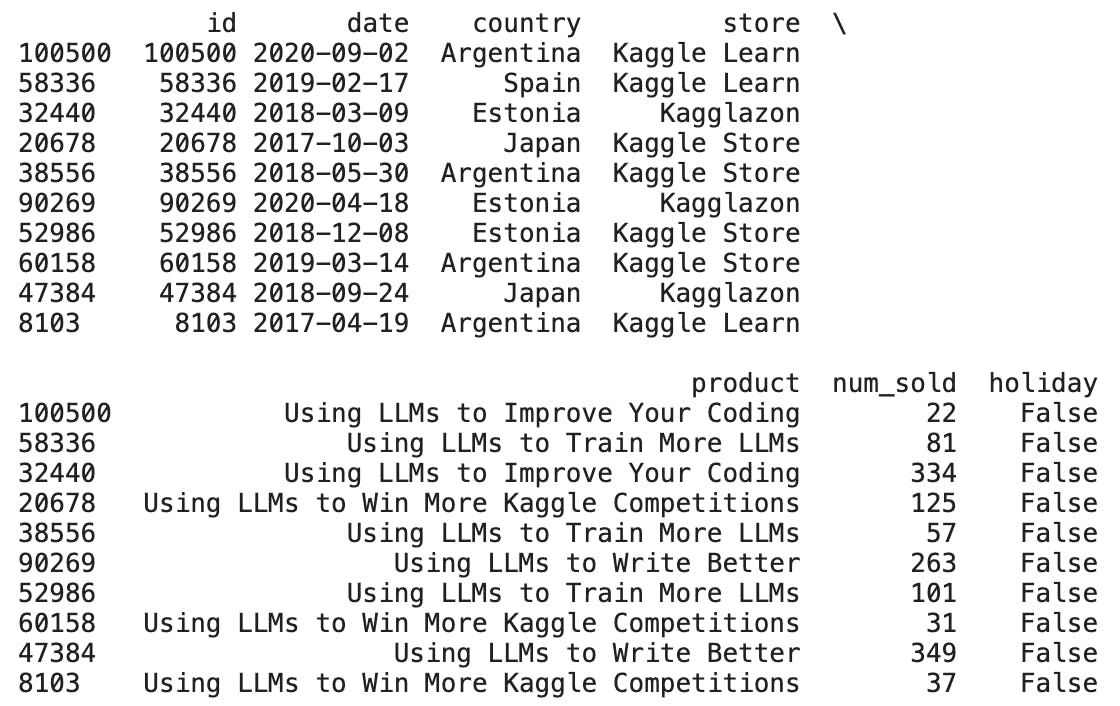
We now have a holiday column.
Similarly, you can create new feature columns as required for the problem you're trying to solve.
That brings us to the end of the EDA. Please explore the notebook for more insights and charts. Don't miss the 'sunburst' chart, it's fun to play with and very powerful.
Conclusion
To summarise, we have picked a simple dataset and performed detailed exploratory data analysis on it. We used the steps described by the framework and inferred key insights from the dataset and also created some features of our own.
I hope you found this blog post helpful and that you can take away the key pointers.
I know it's a lengthy post, so thank you so much for reading through it and staying with me till the end.
If you have any feedback, please drop it in the comments so that I as well as anyone reading this post can also benefit from your comment.
See you in the next one.
Cheers,
Uday